Deliverables
What the club took away.
- Category audit of gym club marks
- Six logo routes, two full directions
- Final logo with star and figure
- Colour palette and typeface
- Usage sheet for every ground
Case study · Brand identity
A gymnastics club for three to twelve year olds, and a mark a child would want on their own t-shirt.
The feel
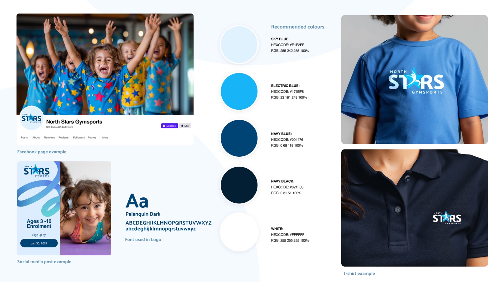
North Stars Gymsports coaches gymnastics to young children, building strength, flexibility and coordination in a warm and supportive environment. The club needed an identity that reads as gymnastics instantly, stays friendly rather than competitive, and survives being stitched onto a polo pocket.
What the club took away.
How it got there.
The brand out in the world.
Start a branding project01 · Background
For most children who walk in, North Stars is the first sport they have ever done. A club chasing national titles can afford a serious mark. A club whose members are five and deciding each week whether they still like it cannot. The logo had to win the parent who pays and the child who decides whether there is a second week.

02 · The figure
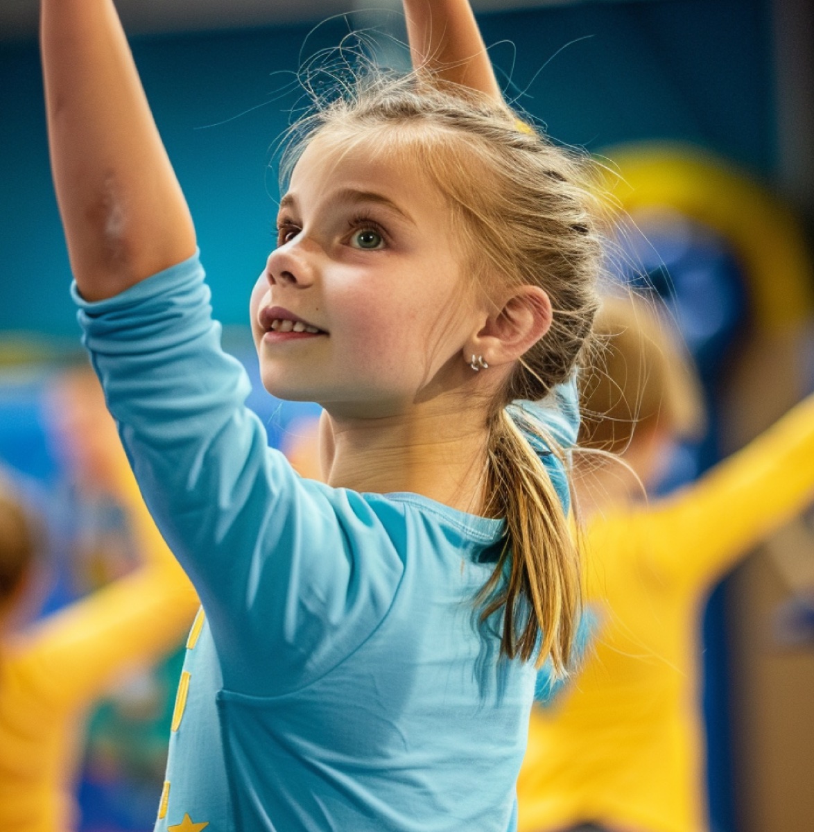
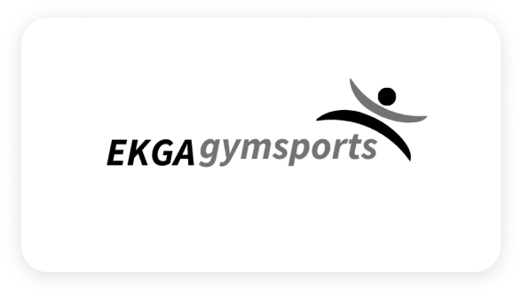
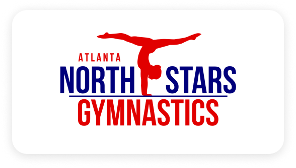
An abstract figure mid-leap, arms thrown up. It works: it says a body moving before a word is read, it has no age or gender, and it is always rising. But six clubs, six swooshes, and nothing to tell them apart. So the figure stays, anchored to something only this club owns: the star already in its name.
03 · Routes
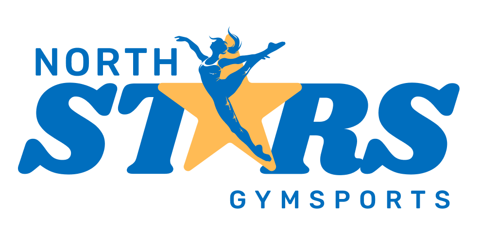
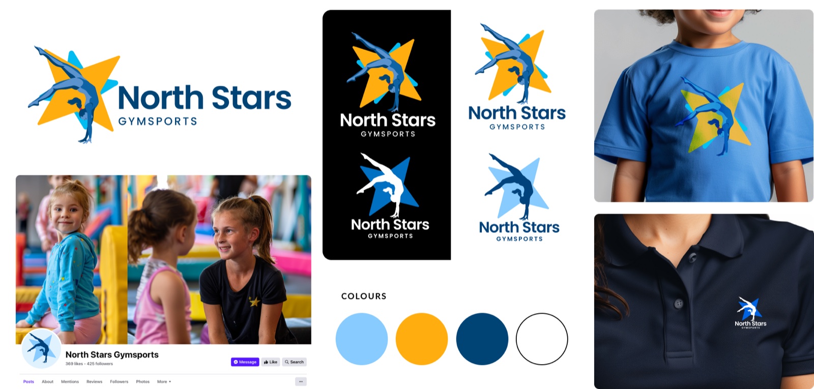
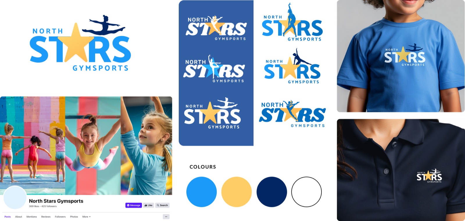
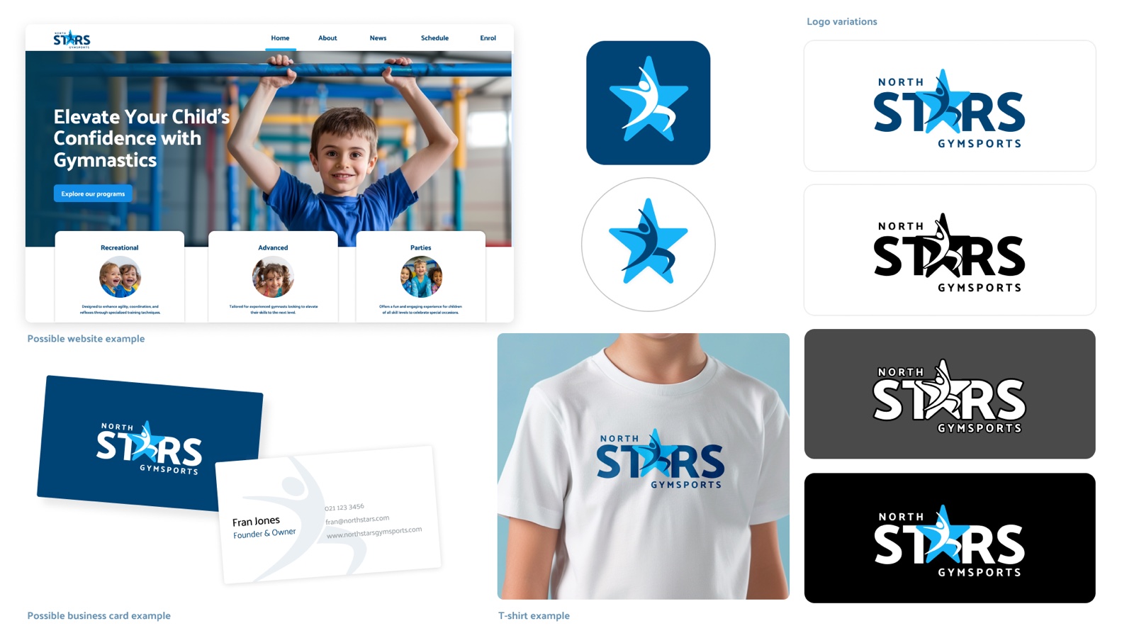
Every route kept the star and the figure and changed how they relate: above the word, leaping across it, standing in it. Two directions were built out on a polo and a page of social posts. The warm yellow route photographed beautifully and fell apart small. The blue route held.
04 · Final logo
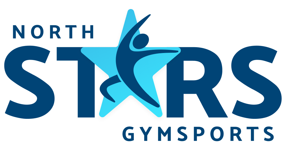
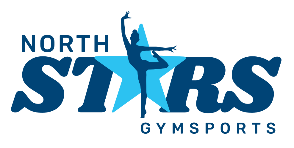
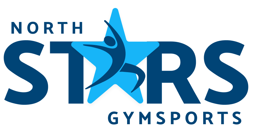
The star replaces the A in STARS, so the mark and the name are one object. The figure stands inside it, arms up, the pose a child makes when they have finished a routine and want you to look. Take the colour out and it still reads, because the figure and the star are separated by shape rather than tone.
05 · In use
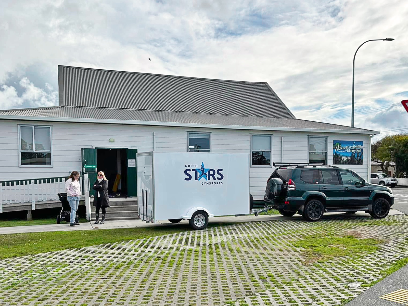
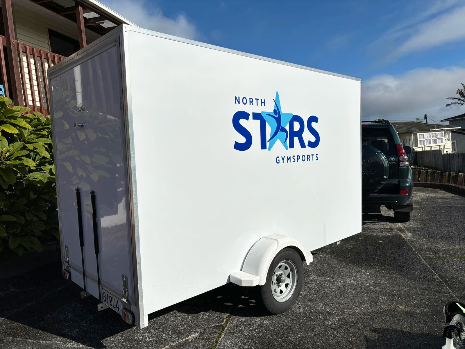
Almost none of it is on a screen. It is on a polo at eight in the morning, a t-shirt worn home, an enrolment post, and the trailer that brings the equipment to the hall. That trailer went out wrapped in the mark, so the brand arrives before the gym does.
Colour
#17B5F8The star, and the energy#004476Wordmark and figure#021F33Body copy and uniform#E1F2FFBackgrounds and panels#FFFFFFGround for the markType
Strength, flexibility, coordination.
The typeface the logo is drawn from. Open, rounded forms that stay friendly at a heavy weight.
Tell me about your business and I'll come back with a clear, fixed price. Sending a request is completely free.